Module Introduction
The first lecture kicked off with a typical overview of the module. This was followed by the idea that we need to create a blog with weekly entries that highlight our knowledge and understanding for the week. I really think that this is a good model for learning as it helps us to better understand the concepts learned by being able to explain them in a publishable manner. The module, as first impressions go, seems to be far more interesting than the title may seem to lead.
The coming into being of CSS & its' syntax
When the internet began to grow in popularity and web-developers started to realise that a little effort in the webpage design wouldn't hurt, the need for better formatting tools arose. At first, the ability of writing formatting in the HTML code seemed to be the solution. Soon, it became apparent that this could lead to much complications and confusion. Therefore, CSS (Cascading Style Sheets) was born. A tool for describing how to display HTML elements and thus creating a separation between the actual content and its' formatting. The separation could also take the form of two separate files. .html for the content and .css for the formatting.
Through http://www.w3schools.com/css I was able to get a grasp and understand the CSS syntax with the aid of its' practical examples. The basics were quite straight-forward. Having many lines of CSS code was a bit confusing at first but after some time it got more and more familiar.
Tackling a practical example
For a practical example, I visited www.csszengarden.com and download the sample HTML and CSS file. I opened both in Dreamweaver and started tinkering with the CSS code. I set a rough idea of the changes I wanted to make to this design.
It consisted of:
- Moving the "Summary" section to the right
- Moving the "Select a Design" section to the left and widening it
- Re-arrange the first two headings
- Change the background to something different
First I took a look at the actual webpage and trying to understand its' design. For this, the Google Chrome "Inspect Element" feature proved to be extremely useful. It allows you to select an element and view all its' relative CSS and HTML code.
Back in Dreamweaver, I experimented with the elements by temporarily removing some of them to view the effect on the whole webpage. The whole structure of an element within an element, to define the appropriate design used in CSS, soon became apparent.
Then I set about constructing my own design. Paddings and margins became a headache at first, but after some re-thinking I got the "Summary" and "Select a Design" sections were and how I wanted. The "float" attribute for an element was quite useful since it allows elements to wrap around each other. This is essential since users tend to have different screen resolutions/sizes.
Diversity is the biggest headache for webpage designing; trying to get the same webpage to be displayed in the same manner in all the browsers. This became blatantly apparent when consulting CSS websites. One such example was that I wanted a round-cornered box around my "Summary" section. A quick search led me to the "border-radius" tag which was recently introduced in CSS3. When I implemented this and tested it, Chrome displayed a rounded box while Firefox and Internet Explorer didn't.
To complete my design changed the first two headings and included two fairly large backgrounds that will change the mood and feel of the page; displayed at the top and bottom of it.
Some sample code used:
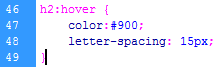
The code below changes the color to red and widens the letter spacing for when the mouse is hovered on Heading 2
The code below adds a bottom image, puts some spacing for it and repeats it horizontally

The final design and adjustments are displayed in the image below. That's all for this week.
